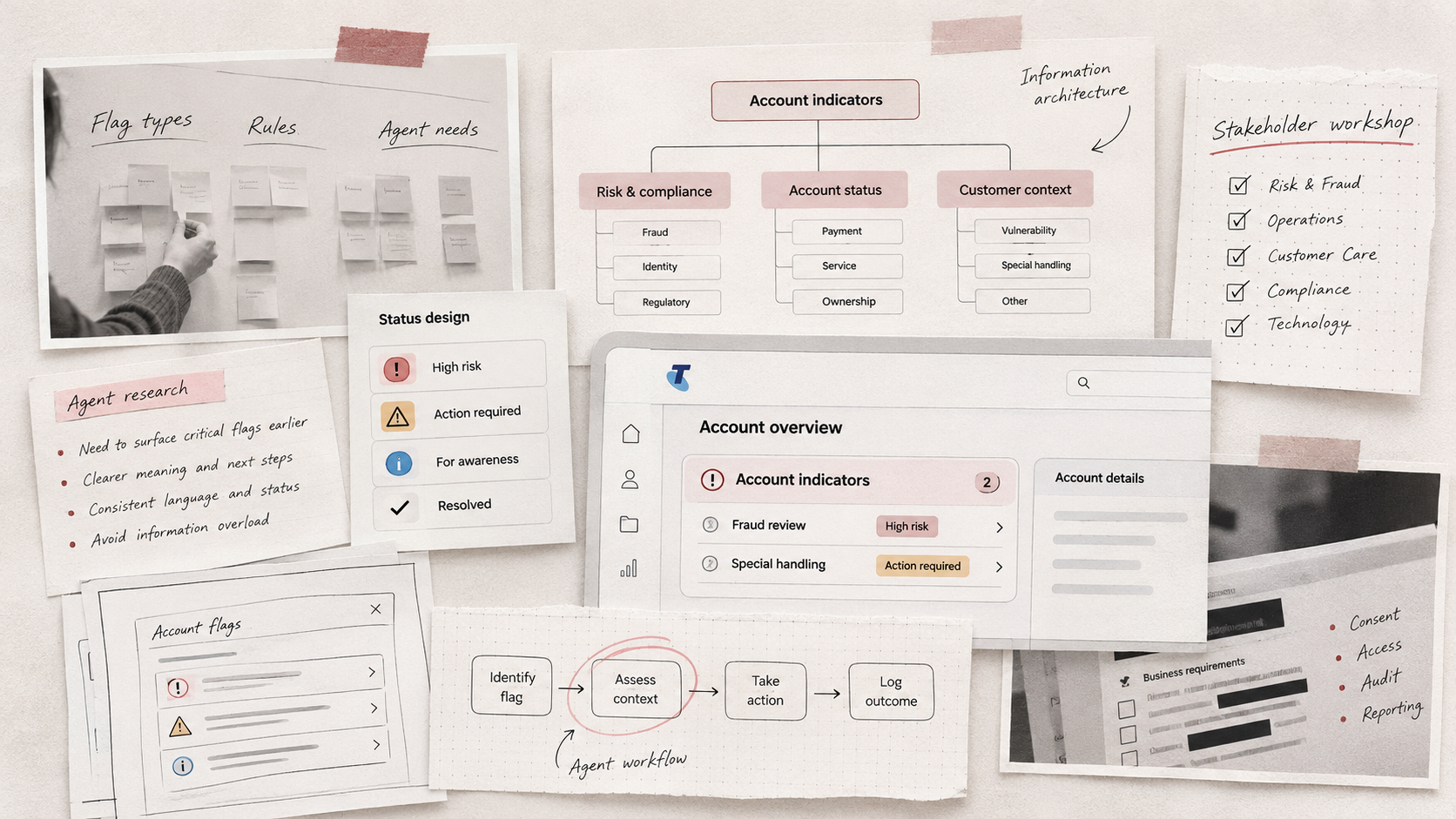
The problem: Customer service agents need to identify important account information quickly and accurately while assisting customers.
However, account-level indicators can represent different types of information, each with its own meaning, priority and associated requirements.
Presenting these indicators clearly within a complex enterprise platform required careful consideration of information architecture, visual hierarchy and interaction design.
The challenge was to develop an intuitive approach to displaying Doing Good Business Responsibly (DGBR) account flags, helping agents recognise important information and understand its relevance during customer interactions.
Project background
At Telstra, I contributed to an initiative focused on the design and presentation of DGBR flags within the Salesforce-based Console platform.
The project involved collaborating with stakeholders across different departments to understand the types of account information that needed to be represented and how agents should interact with these indicators.
The work included exploring categories, flag statuses, visual treatments and how important information could be surfaced within the existing interface.
-
Improve the visibility of important account-level information.
Establish a clear and consistent approach to flag categories and statuses.
Help agents distinguish between different types of indicators.
Support informed decision-making during customer interactions.
Create a scalable approach that could accommodate different business requirements.
-
Senior UX Design, Stakeholder Research, Information Architecture and UI Design
Understanding the requirements

I participated in stakeholder meetings with representatives from different areas of Telstra to understand the purpose of the flags and the requirements associated with them.
The discussions explored what information needed to be displayed, how different indicators should be categorised and how their status or relevance might change.
One example involved fraud-related account indicators, where it was important for agents to recognise relevant information before proceeding with certain interactions.
The project required bringing together different departmental perspectives and translating complex requirements into a coherent user experience.
Organising complex information
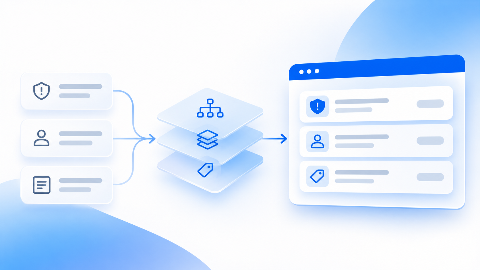
A significant part of the design challenge involved information architecture.
Different flags could communicate different types of information, and the interface needed to make these distinctions understandable without overwhelming agents.
I explored how indicators could be grouped, labelled and prioritised to create a more consistent and predictable experience.
This involved considering the relationship between flag categories, individual statuses and the information agents needed to access.
The aim was to establish a structure that supported quick recognition while allowing agents to understand the context behind each indicator.
Exploring visual hierarchy and status design
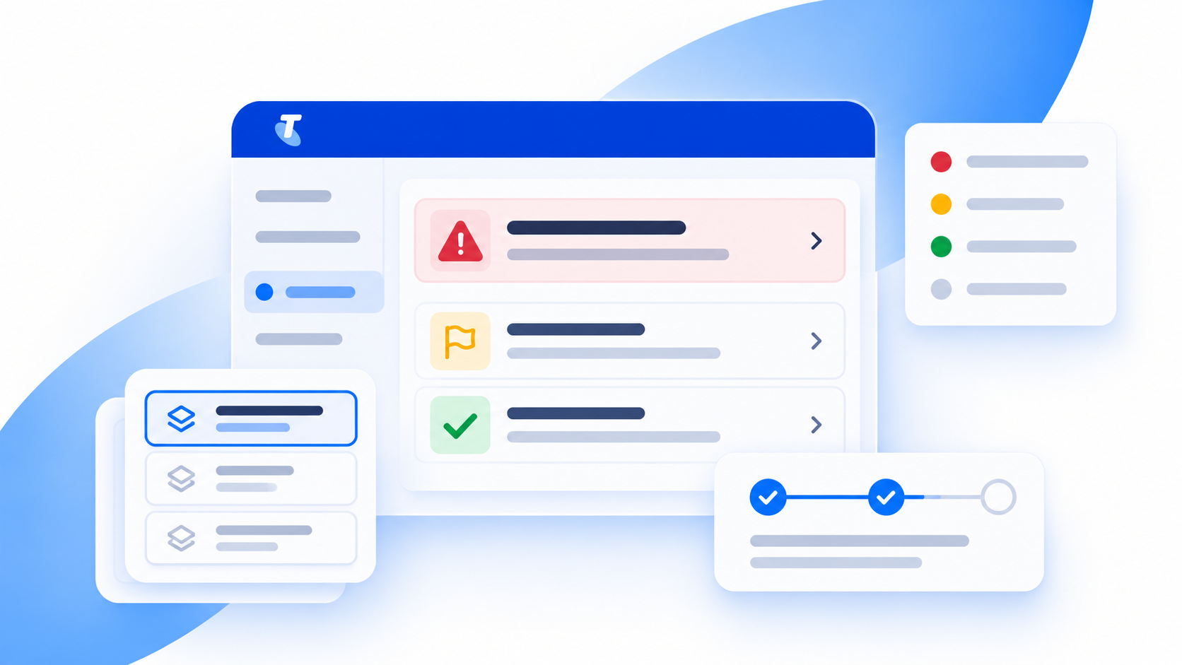
I developed interface concepts in Figma to explore how the flags could be represented within the Console experience.
The design work considered how visual elements such as labels, icons, placement and status treatments could help communicate meaning.
An important consideration was ensuring that agents could distinguish between different indicators without relying solely on visual styling.
I also explored how the interface could communicate changes in status and provide sufficient context for agents to understand the significance of the information presented.
Balancing stakeholder and user needs

With requirements coming from multiple business areas, collaboration was central to the project.
I worked through competing considerations with stakeholders, exploring how different needs could be accommodated within a consistent design approach.
The challenge was to balance the visibility of important information with the practical needs of agents working in a busy customer service environment.
The design needed to support quick recognition without introducing unnecessary visual clutter or disrupting existing workflows.
Developing a consistent approach
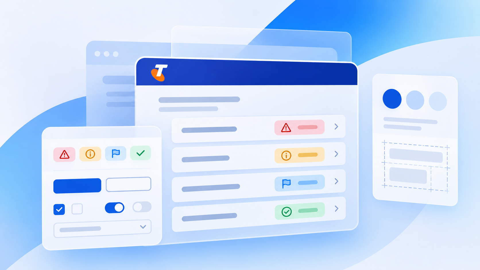
The proposed design direction focused on creating a clearer structure for account-level indicators, supported by consistent visual patterns and status treatments.
By considering categories, hierarchy and interaction behaviour together, the work aimed to make important information easier to locate and interpret.
The approach also considered how the design could support additional indicators or changing requirements over time.
Outcome
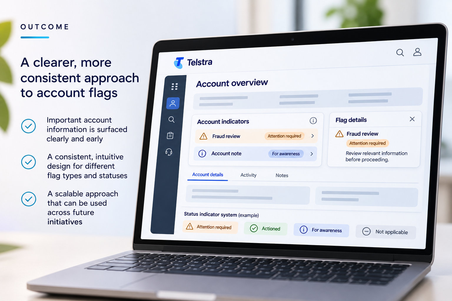
The project contributed to a more structured approach to presenting important account information within the Salesforce Console platform.
Through cross-functional stakeholder engagement, information architecture and interface design, I helped translate complex business requirements into a proposed experience focused on clarity, consistency and recognition.
The project demonstrates my ability to navigate competing requirements, organise complex information and apply systems thinking to enterprise interface design.
Confidentiality note: The visuals presented in this case study are AI-generated illustrations created to represent the design concepts and processes discussed. They are not actual Telstra interfaces or internal documents. These illustrative visuals have been used to protect Telstra's confidential information and intellectual property.